18 Jul

Stylish Black and White Decor

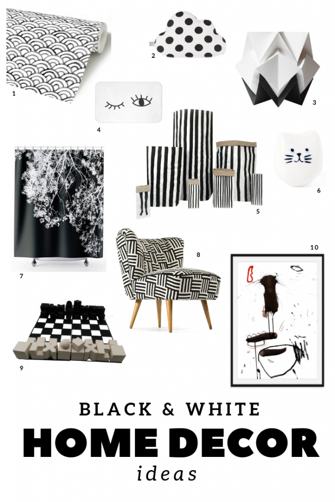
There’s something special about black and white. I love their sobriety and simplicity, yet they are strong and powerful. How to ADD STYLE to your decor with black and white? What we can do with these two colors is endless and I want to share with you ten beautiful products that can add a dramatic effect in your decor!

1. Adhesive wallpaper by RemovableWallpapers.

2.  Decorative cloud pillow by ProstoConcept.

3. Origami table lamp by TedzukuriAtelier.

4. Bath mat by AhavtiLifeStyle.

5. Paper bags by AgiandtheWind.

6. Mini ceramic cat by DodoToucan.

7. Shower courtain by OJPGallery.

8. Coctail chair from 1970 by updatechair.

9. Chess board by Redrook3D.

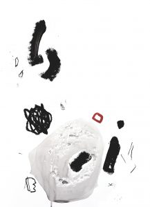
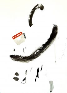
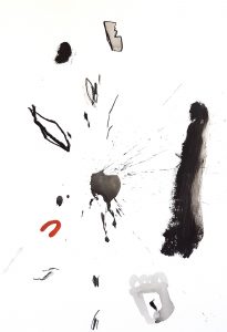
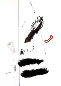
10. Original abstract painting by me!  You can see the entire collection here.

Enjoy!

11 Jun

The ultimate CMYK colors gift guide

I want to share with you my ultimate gift guide in CMYK, where you can find some very CREATIVE ways to use CMYK colors! But first, what is CMYK?CMYK stands for cyan, magenta, yellow and black and is the color profile used in offset printing for full color documents.
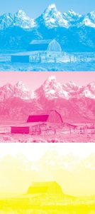
The four-color mixture printing process uses four printing plates; one for cyan, one for magenta, one for yellow, and one for black. When the colors are combined on paper (they are actually printed as SMALL DOTS), the human eye sees the final composite image with different color combinations (adding equal amounts of pure cyan, magenta, and yellow should produce black). Everything we see printed on paper is normally created with these 4 colors, amazing isn’t it?

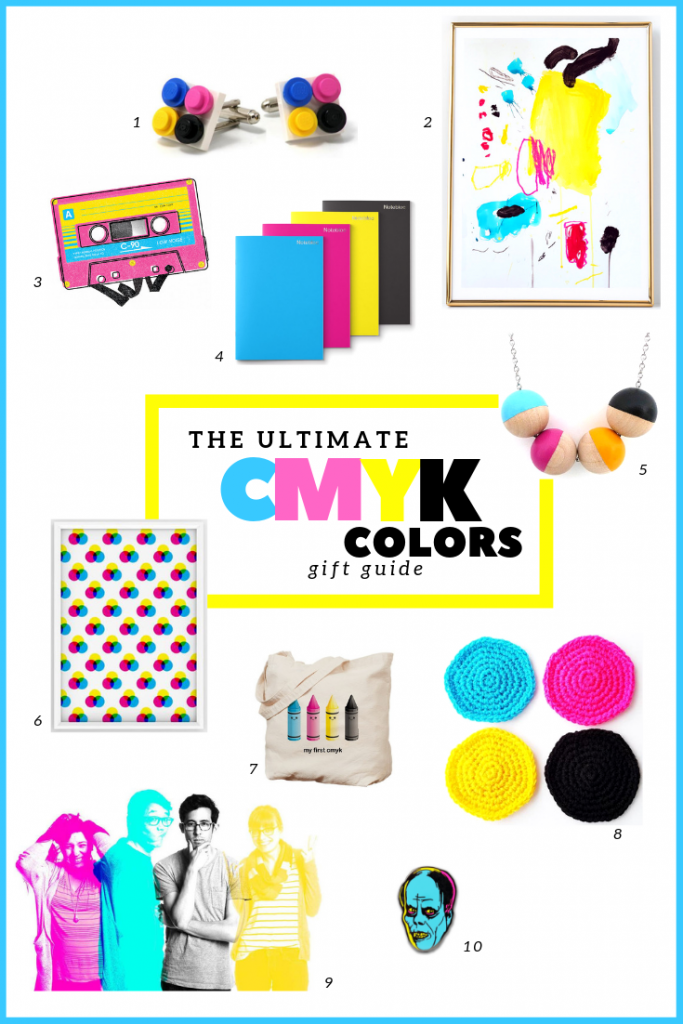
These colors can be also used separately as a fun and bold combination as we can see on some great products that I have found online:

1. Cufflinks made with original LEGO® bricks by Agabag.

2. An original abstract painting made by me! Check the entire collection here.

3. Illustrations by Mauresa Mitchell.

4. Four notebook pack, by Notebloc.

5. Stylish wood necklace, by Paragraphloop.

6. Downloadable art print by Denisa Viková.

7. Tote bag designed by Kimchikawaii.

8. Crocheted coasters by Amanda Suckling.

9. CMYK Photo Booth by Orange Photography.

10. Phantom enamel pin by Paul Johns.

Enjoy!


17 May

My Creative Life

I really like to read about the “normal” life of artists and to see that every daily experience that seems trivial to them has become part of their creative development, leading them to express art in one way or another. After all, creativity comes from the most unexpected sources. Creativity is everywhere!

This is my story so far:

CHILDHOOD: I did not study much at school, but I always passed everything. I watched a lot of black and white TV and played non stop with my sister (oh yes, Chile in the 70s. That should be another blog post).

UNIVERSITY: I studied graphic design, thinking it was more like art but at that time, computers took over and I didn’t like using computers at all. I realized that my thing was actually artistic work using my hands.

At that time I also made my first abstract paintings – wild and strange creations with hand-made paper -. I devoted myself completely to experimenting with that for a long time and I even wrote a small thesis about the artisan work in design (spoiler alert: a very bad one).

AFTER UNI: I worked as graphic designer with computers, hated it. Quit. Traveled a lot. Arrived in Barcelona and fell in love with someone at the same time as with printmaking. Awesome times!

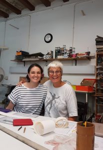
Then came the day when I signed up for a printmaking course for a few months and when I entered the workshop for the first time, I simply felt that this was my place! Clara Oliva would become my teacher for many years, and to her I owe everything I know in printmaking as well as in expressing myself graphically through abstracts. Several years later, I had a hard time making the decision to go to a workshop on my own and get away from her expertise. I could never separate completely: until last year I was still going to her workshop to do aquatints, methodical and precise technique that contrasts and complements my more improvised and chaotic way of working.

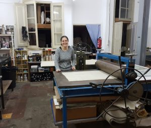
THE STUDIO IN BARCELONA: I left my teacher’s studio and started by myself in a gorgeous old workshop that I shared with other artists. Prolific times developing my work and experimenting with different techniques, work styles, formats and colors.

I generated some great bodies of work and some very bad. I did courses, open workshops and participated in many competitions that allowed me to exhibit my prints at Krakow Triennial in Poland, Guanlan Prints in China and many others. I started selling online.

TODAY: I have less certainty than when I was 20, but I definitely prefer this. I no longer have a printmaking studio due to a slow-life change: I moved from the city life of Barcelona to a small village in South of France. Now I only have a small desk and I have dedicated myself to making illustrations and small paintings. Adapting to working online for my store and website has been quite difficult: the online art world seems a bit false and pretentious to me, but I have to adapt and manage to stand out with honest works. I miss my print studio, but to be honest, not as much as I would have believed it because I found painting! The result was very daring and elegant within so many spots and brushstrokes, I will continue working on it!


19 Apr

Black and White Wall Decor

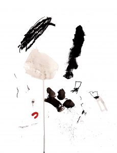
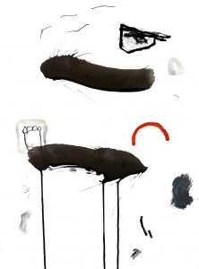
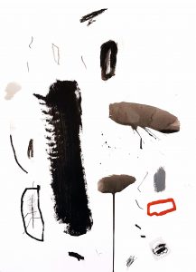
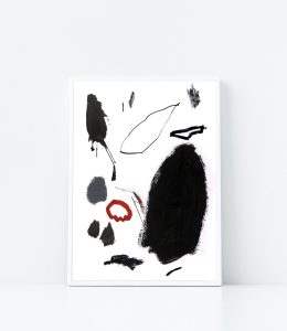
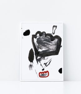
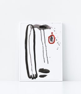
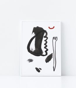
What is it that makes black and white abstract paintings so captivating?

I love monochrome paintings because they seem to hide something, they are mysterious pieces of art! Let’s see why:
Black and white are silent colors with a strong personality. They have a lot to say….
They are dramatic, all the time searching for that perfect “ying and yang” balance…
They are elegant, they are always dressed for a party…
They are modest and ready to make any design perfectly restrained…
They are like discreet people, saying a lot only by the look in their eyes…

Do you agree?


I painted this series on paper and they are available on my website, my Etsy Shop and my Saatchi Gallery.

18 Apr

Primary Colors Paintings


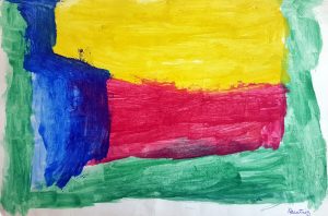
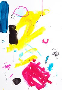
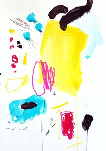
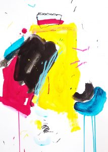
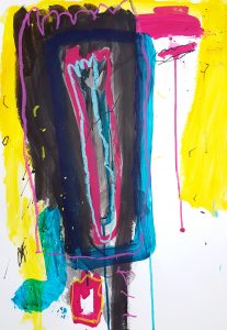
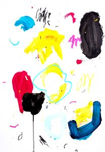
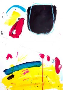
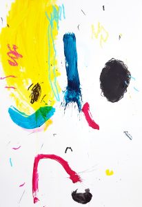
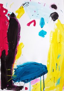
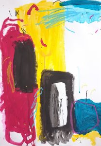
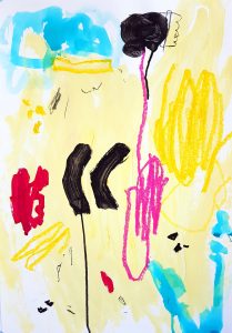
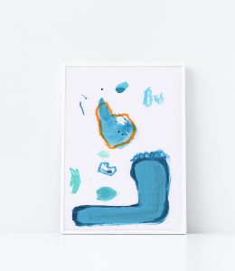
I love CMYK colors, I think it is such a cheerful palette to play with. To create this series of abstract paintings first I placed one color at a time and waited for the result, it was fun! These colors illuminate, give life, contrast and movement. It is amazing to create so much energy with only a few colors, they have a personality of their own and not only “just to print something” as we normally see them.

What do you think about this bold color combination?

These paintings are also available in my Etsy Shop and my Saatchi Online Gallery.

17 Apr

A Liberating Brushstroke

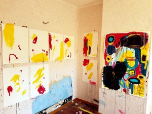
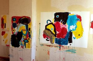
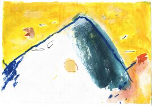
I have only a desk as a studio nowadays where I’m painting in quite small sizes and also doing a lot of abstract art journal drawings. I miss my former printmaking studio! But a few months ago I had the chance to use for a short period of time an old house who was going to be entirely renovated. That meant that I was able to do anything on it: paint walls, floors, cleaning brushes anywhere, spill paint all over without control. It was … LIBERATING!

I painted a lot in very large formats for the first time. I felt like creating without control and without searching a specific purpose: the place was the perfect chaos that for many years I was trying to control. No boundaries, no meaning, no titles, no right or wrong to the art world. Experimenting with all kinds of mixtures and colors made me aware that those abstracts are the perfect contrast in my life: I do not dare with a lot of “domestic-real” things everyday, but I can really be bold with painting. I felt I could experience that abstract art is about passion, courage and emotions that become real through colors and textures.


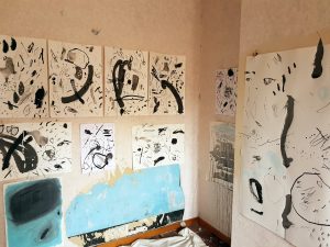
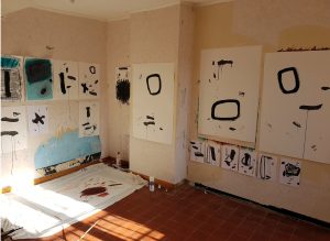
I loved the result, it was very daring and elegant within so many spills and brushstrokes! I called them “Color Studies” because I just picked a color I liked and started to interact with paper until they turned into a cohesive body of work, both colorful and monochrome.

What liberating thing have you done recently?

10 Mar

10 Facts About Me

I’ve never REALLY taken the time to introduce myself because to be honest, I ended up convincing myself that no one would care to read about RANDOM things having to do with me. But I think it could been actually very therapeutic to share more of me here. Maybe you can help me out to understand why I do what I do as an ARTIST (It’s been always very hard for me to explain what is pure instinct and guts), or maybe I want to do this for the simple fact that I like knowing quirky things about people that I follow online and I do not know at all (dark side of me).
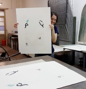
Any psychologist out there? HELP…

1. I walked 28 days to SANTIAGO de COMPOSTELA, an experience that I keep as a treasure in my heart every day.

2. Since I was a kid, I avoid to work in groups or participate in teams.

3. I do not like concerts or people events, I PANIC among crowds.

4. I am chaotic. I keep this a secret, I look like organized but I am totally NOT, I can not follow plans, lists, schedules or can’t organize a drawer…

5. My favorite movie is FORREST GUMP.

6. I love to learn languages and I have recently learned a couple of phrases in POLISH.

7. I love to listen to LED ZEPPELIN’s rough sound. Fortunately, I never had the chance to go to their concerts…I had panicked.

8. My handwriting is HORRENDOUS (and of course, chaotic). That’s why I think I love typography and I use it a lot in my work.

9. I do not like to define myself. Those statements “I am like this”, “I’m not like this”…who can actually tell so in a constant EVER CHANGING life?

10. I share birthday with Chuck Norris, Sharon Stone and Jon Hamm… which is TODAY.

My BIRTHDAY PRESENT? Visit now and then my visual BLOG posts on my website (where I to try to keep updated with recent an older work and a few words about it), to my beloved SHOP (where I am also constantly adding new things and special shipping promotions) or my PINTEREST boards (where I keep a nice gallery with other people’s work which I like).

And, if you would like to know a little more about me, you can sign up to my monthly newsletter!

Thank you all and enjoy March! (which is my favorite month).
 

01 Feb

Ink Paintings

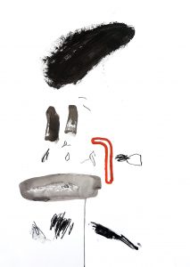
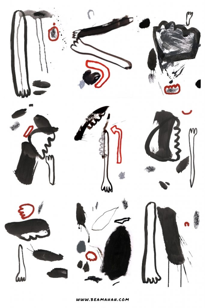
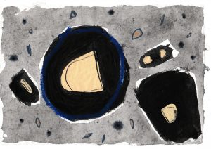
I have created these monochrome ink paintings with the simple idea of contrast: contrast between the color and the paper and contrast between drawing materials. What do you see on these small paintings? Do you try to find a significance on the image or do you see abstract colors and textures?
 

This is a large collection of 8″ x 11″ small paintings on paper and they are all available on my website.
15 Jan

Art Journal Inspiration

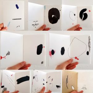
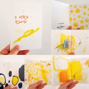
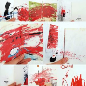
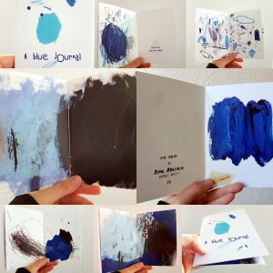
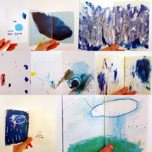
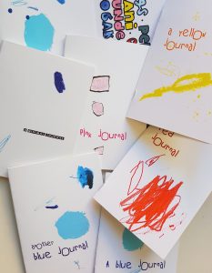
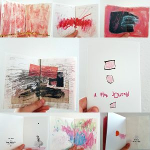
My art journal pages are now available as booklets! You can have your own collection of my work in tiny version. They are also perfect to get inspiration for your own art journal projects!

If you are interested, please contact me. I will print one especially for you.

If your favorite color is not here, no problem! You will certainly find it in the editions to come.

Take a look!

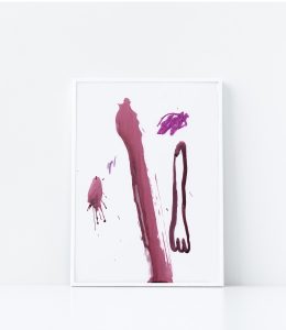
PINK

MINIMAL

YELLOW

RED

BLUE

ANOTHER BLUE

09 Dec

Abstract Drawings on Hand Made Paper

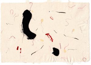
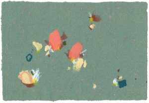
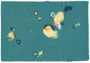
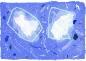
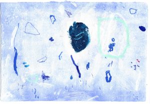
At the beginning of the year I received these wonderful hand made papers as a gift from a friend and it took me a long time to decide what to do with them, as it was a meaningful gift for me. These papers arrived by surprise at the time I was about to leave Barcelona. They came from a wonderful person who was the first one to believe in my art skills like a million years ago when she let me be part of her workshop without knowing me at all.

When I received this unexpected gift, it was a complicated moment for me. It made me think about my future as an artist and especially made me look back and remember the year ’96 when I made my final dissertation at university about….hand made paper and graphic design! (Unfortunately, I have no pictures of it: no digital cameras nor phones back then!). Life was telling me something! It made me remember a recent trip to Japan as well: my friend has lived there and we have this same sense of “aesthetics”, we were so connected without thinking about it!!

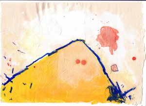
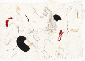
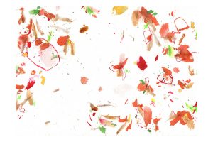
I made these paintings trying to maintain the texture of the original paper: its threads, sparkles and little pieces. Make the paper part of the design.

My friend’s name is Alexandra and she has a wonderful blog and business about Kyoto (it is in French but do not worry, I do not think aesthetics has a language!). She has also a career as a pattern designer on a website called Tristan and Zoe.

I hope you like these drawings! They reminded of my student years…;)

I have some listed in my etsy shop if you want to check some details. I will list all of them soon!

https://www.etsy.com/listing/649984647/flowers-painting-matching-art-set